
Understanding Comics

TED Talk: Scott McCloud - Understanding comics
We’ve all been there: staring at a blank screen, a new campaign brief in hand, and the daunting task of telling a compelling story with a series of images, a carousel, or a single infographic. How do you turn a static collection of visuals into a narrative that captures attention and drives action? The answer might not be in the latest marketing textbook, but in a 30-year-old comic book theory guide: Understanding Comics by Scott McCloud.
At first glance, McCloud’s book is a deep dive into the history and mechanics of sequential art. But for marketers, it’s a masterclass in visual communication. McCloud’s core principles of closure, sequential art, and the power of icons are not just for comic book creators; they are the fundamental building blocks of modern content marketing. By understanding them, we can learn to guide our audience's minds and craft more impactful stories, one visual "panel" at a time.
The Art of "Closure" in Content Marketing
In a comic, "closure" is the mental leap a reader takes to fill in the gaps between two panels. McCloud argues that this process isn't just about comprehension; it's about active participation. It’s the magic that turns a sequence of static images into a dynamic story in the reader’s mind.

As marketers, we can leverage this powerful concept by designing content that encourages our audience to "close the gap" themselves.
Infographics are a perfect example. Instead of a dense wall of data, a great infographic uses visual breaks, clear sections, and strategic negative space. Each section acts as a panel, guiding the reader from one data point to the next, allowing their mind to connect the dots and form a larger conclusion. The story isn't just told; it's co-created by the audience.
On social media, a carousel post is not merely a collection of images—it's a series of deliberate panels. Each slide should build on the last, creating anticipation and encouraging the user to swipe to the end. The final slide, the "punchline" or the call to action, provides the satisfying closure to the mini-story you’ve told. By doing this, you're not just presenting information; you’re taking your audience on a journey.
Guiding the Journey with Sequential Art
McCloud defines sequential art as "images juxtaposed in a deliberate sequence to tell a story." This isn't just a definition of comics; it’s a blueprint for designing a seamless customer journey. The path a user takes through your website, from landing on a homepage to making a purchase, is a sequence of events—a series of panels you have the power to control.

Website layouts should be treated as a form of sequential storytelling. The homepage is your opening panel, setting the scene and introducing the key players. The menu, clear calls to action, and a logical scroll path are your transitions between panels, guiding the user intentionally from problem recognition to solution. A cluttered, chaotic website is like a comic with panels out of order; it confuses and disengages the reader. A well-designed site is a clear, compelling narrative.
Interactive content, such as quizzes or guided experiences, takes this a step further. Each answer or choice the user makes leads to a new "panel," a new piece of the story tailored to their input. This makes the user not just a reader, but an active participant and co-author of the brand's narrative.
The Universal Language of Icons and Imagery
McCloud delves into the spectrum of icons, from the highly realistic to the abstract and symbolic. He argues that the simpler, more iconic a symbol is, the more it can represent and resonate with a wider audience. This principle is fundamental to both branding and user interface design.
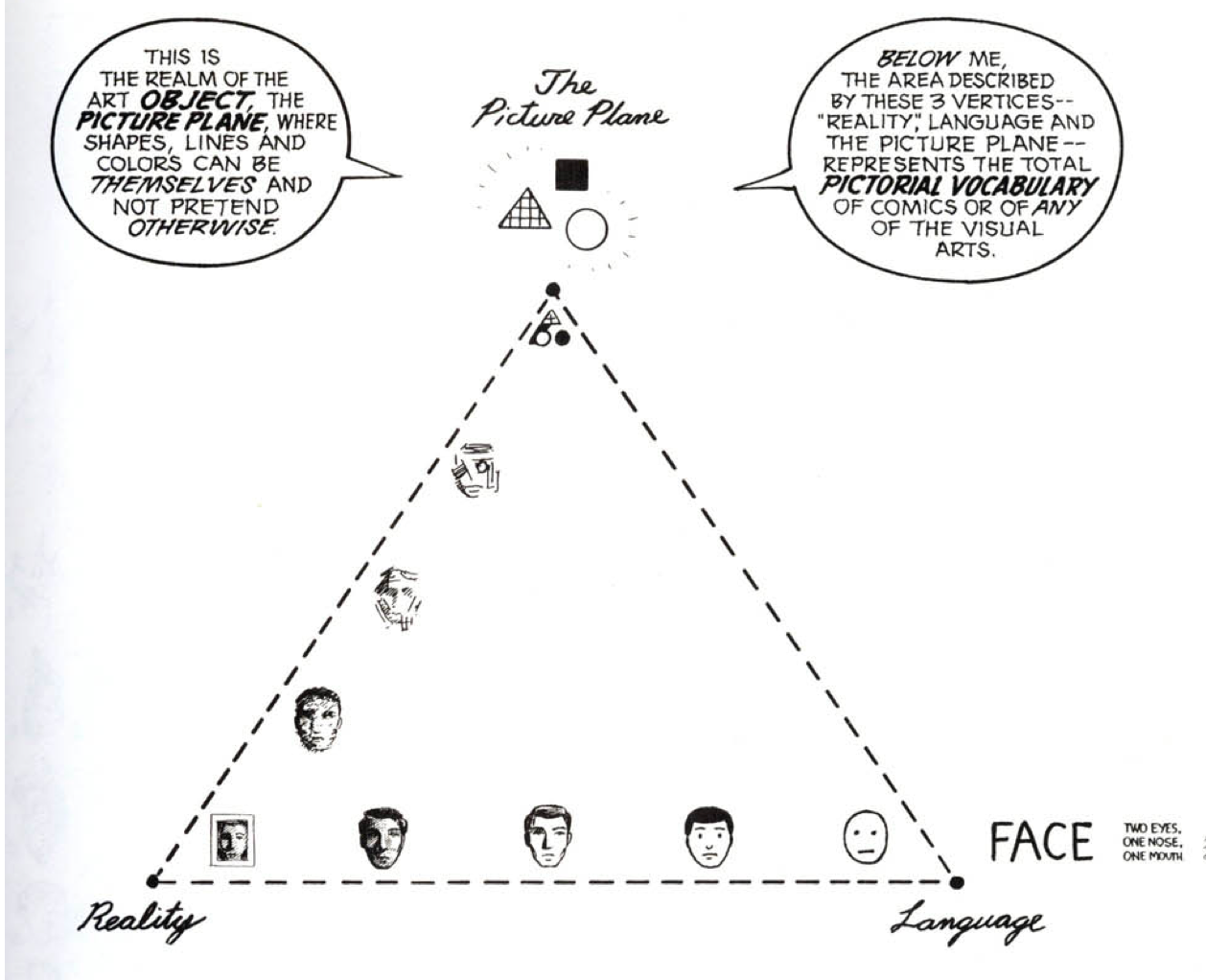
This is where McCloud's concept of "the picture plane" becomes especially relevant. He uses a triangular model to explain how visual communication moves between three points: Reality (photorealistic images), Meaning (abstract language like words), and the Picture Plane itself, which represents pure, unadulterated art—where lines, shapes, and colors are appreciated for themselves. Great visual marketing often lives at the intersection of these points. By intentionally choosing a style that leans into the "picture plane," you can create visuals that are not just representational, but emotionally resonant. It's the difference between a generic stock photo and a beautifully crafted, stylized graphic that speaks to your brand's unique identity.
Branding is built on this idea. A brand's logo, color palette, and visual style are a powerful collection of icons that instantly convey personality and values. Think of the simplicity of the Nike swoosh or the Apple logo—they are so iconic they transcend language, instantly communicating a brand's ethos. The goal isn't just to have a recognizable logo, but an icon that carries a world of meaning within its simple form.
In user interface (UI) design, the importance of universal icons cannot be overstated. A magnifying glass for search, a shopping cart, or a house for the home button are all symbolic icons that make digital experiences intuitive. They are a universal language that allows users to navigate a site without having to read a single word. McCloud's work teaches us that these simple, almost invisible icons are the connective tissue of a seamless user experience.
Conclusion: From Panels to Profit
By thinking like a comic book artist, marketers can leverage closure, sequential art, and icons to create more engaging and effective content. The power of visual storytelling isn't just about making things look good; it's about guiding your audience's mind, creating a connection, and ultimately, inspiring action. The next time you sit down to create an infographic, design a social media campaign, or build a website, don't just think in terms of content. Think in terms of panels, transitions, and the beautiful, invisible story you're asking your audience to create in their minds.
What's a piece of marketing content that you've seen that feels like a perfectly crafted sequence?